The short answer
Your photos sell the stay, but they aren't your brand on their own. A logo and a name that stay the same everywhere are what guests remember, and what they search for when they want to come back. Since Airbnb and Vrbo don't let you put your logo on listing photos, the brand has to live at the property, on your website, on Google and on anything you sell. A brand kit is every version of that logo, your colors and your icons, made once in the right file types. It comes before the website, because everything else pulls from it.
Does my Airbnb need a logo?
Ask most hosts and they'll say no. The photos are the brand. The hero shot of the porch or the view from the deck is what makes someone book, so why bother with a logo?
They're half right. Photos sell the stay. Nothing beats a great photo when someone is scrolling through a page of listings.
But a photo is hard to remember and impossible to search for. Six months later, a guest won't remember which porch it was. They might remember a name and a logo, if they saw them enough. That's the other half of a brand, and it's the half that brings guests back to you instead of back to Airbnb.
A logo also goes places a photo can't. Your sign, your Google profile, your social media pages, your website's browser tab, your welcome book and a sticker on the back of someone's camper.
Put your brand where guests stay
On Airbnb and Vrbo, there isn't much room for your brand. Vrbo says photos with text overlays like URLs, or watermarks with logos, may be rejected. Airbnb doesn't allow links in listings that take people off Airbnb. On the listing, you look a lot like every other host.
The stay is different. For a few nights, guests see your place every day. That's where the brand should show up. A sign out front. The welcome book. The Wi-Fi card. A keychain, a mug, a door hanger. Same name, same logo, same colors.
And keep the name the same everywhere. If you're “Riverbend Cabins” on Airbnb, “Riverbend Cabin Rentals” on Vrbo and “The Bend” on your sign, guests have three names to remember and none of them stick. One name, used everywhere, is what turns a good stay into a search.
- 1They stayThe name and logo are on the sign, the welcome book and the Wi-Fi card.
- 2They rememberSame name on Airbnb, on Vrbo and at the door, so it sticks.
- 3They search itNext trip, they type your name into Google, not “cabins near the river.”
- 4They recognize youYour website comes up with the logo they saw at the property.
- 5They book directNo marketplace in the middle, and no other listings to shop.
You're not asking anyone to break a rule. You're making your name easy to remember, so the guest who loved their stay can find you again. When they do, your website should look like the place they remember.
Stickers, hats and shirts
Whenever my family travels, the kids want a sticker. State parks and national parks are the big ones, and they all end up on our camping trailer. We're not alone. Look at the back of any camper at a campground and you'll see where it's been.
That's a brand doing its job twice. The park makes a few dollars on the sticker, and then the sticker rides around advertising the park to everyone parked next to us.
A campground, RV park or inn with an office or a front desk can do the same thing. Stickers, hats, shirts, mugs and koozies are small extra income, and every one of them is a guest putting your name in front of other travelers. A vacation rental without an office can still leave a sticker in the welcome basket.
This only works with a real logo. A photo of your pool doesn't fit on a hat. A simple mark in one color does, and a print shop will ask you for it as an SVG.
What’s in a brand kit
A logo isn't a brand kit. Most small properties have one logo file, often a JPG someone emailed years ago, with a white box around it. That one file has to fit a wide website header, a tiny browser tab, a dark photo and a circle on Google. It can't do all of that well.
A brand kit is every version you'll need, in the right shapes, colors and file types, plus a short guide. Before I built this website, I put together a brand kit for Firsthand Stays. Everything on this site comes from it.



- Slate#34566BMain color
- Clay#8A5A3BAccent
- Ink#1C2329Text
- Paper#F3F5F6Background
 Inns
 Cabins
 Rentals
 Campgrounds
 RV parks
 Glamping
 Airstreams
Logo shapes. A wide version for headers, a stacked version for square spaces, and the mark by itself for tiny spaces, profile pictures and merch.
Logo colors. Full color for white backgrounds, white for dark backgrounds and photos, and one color for printing and embroidery.
Colors as codes. Exact hex codes, so the website, the booking engine, the sign and anything you make in Canva are the same blue, not four slightly different ones.
Icons. Small drawings in the same style as the logo. On this site they stand for the kinds of properties I work with. At a property they could be amenities, like pet friendly, river access or a hot tub.
A property can go one step further and give each room or unit its own mark. At Comal Inn, every room has one.
 Cypress
 Mountain Laurel
 Juniper
 New Braunfels Room
 New Braunfels Cottage
SVG or PNG?
You'll want both, because they're good at different things.
SVG files are drawn with math, not pixels. They stay perfectly sharp at any size, from a browser tab to a sign out front, and they're tiny. The whole Firsthand Stays logo is about 7 KB. That makes SVG the best choice for your website, where every bit of file size slows the page down, and for print shops and sign makers.
PNG files are pictures made of pixels. They look great at the size they were made for and get blurry if you stretch them. But almost everything accepts them. Google Business Profile takes JPG or PNG. So do most social sites and email signatures. PNG can also have a see-through background, which JPG can't.
A good rule of thumb is SVG on your own website and for anything printed, and PNG everywhere else. Keep PNGs at least twice the size they'll show at, so they stay sharp on phone and laptop screens.
How your brand shows up on Google
When someone searches your name, a plain Google result has exactly one picture in it, your favicon. Next to it is your site name, your web address, your page title and a short description. Here's what a search for “comal inn” shows.
 Comal Innhttps://www.comalinn.com
Comal Inn | Boutique Vacation Rentals in Downtown New …
Boutique vacation rentals steps from the Comal River and Schlitterbahn in downtown New Braunfels, TX. Five private units. Book direct for the best rate.
- Studio Cottages & Rooms
- Private Cottage Rental
- Location
- Contact
- Icon
The favicon. The only picture in a plain result. - Site name
“Comal Inn,” not “comalinn.com.” Google picks it, and you can tell it which name to use. - Title and text
Both come from the page. The links under it are pages Google picked from the site.
Every part of that comes from your website. The favicon is a file on your site. The site name comes partly from the name your site tells Google to use. The title comes from your page. The description here is the one written for the page. Search a different way and Google sometimes writes its own from your text instead. When your name is searched, Google can also show links to your main pages underneath, like the rooms and the location.
The site name is easy to miss. When I checked, Google showed my own site as plain “firsthandstays.com,” not “Firsthand Stays,” and still showed my old favicon. Google decides what to show, and changes take time to appear. But you can tell Google your preferred name with a small piece of structured data, so I added it.
Favicons, your smallest logo
A favicon is the little icon in the browser tab. It's also the icon in Google results, and the icon on a phone's home screen if a guest saves your site.
Google says a favicon must be square and recommends one larger than 48 by 48 pixels, so it looks good everywhere Google shows it. Then it gets shown much smaller, often around 16 pixels in a browser tab.
Firsthand Stays
16 px32 px48 px96 pxComal Inn
16 px32 px48 px96 pxLook at what happens at 16 pixels. The Firsthand Stays mark is one simple shape, so you can still tell what it is. The Comal Inn favicon is the full round logo, and at that size the words disappear. You still get the green circle, which is recognizable, but a simpler mark made just for tiny spaces reads better. That's why a good kit has a mark-only version.
A full favicon set is a handful of files. There's one for browser tabs, one for iPhones and iPads (180 pixels is the common size), and a couple for Android phones. You make them once and never think about them again.
Link previews
When someone texts your website to a friend or shares it on Facebook or LinkedIn, a picture shows up with the link. That's the link preview image, sometimes called the Open Graph image after the code that sets it.
Comal Inn | Boutique Vacation Rentals in Downtown New Braunfels, TX
comalinn.com
Delivered
If you don't set one, the app guesses. It might grab your logo on a white square, a random photo or nothing at all. The size most sites use is 1200 by 630 pixels, a wide rectangle.
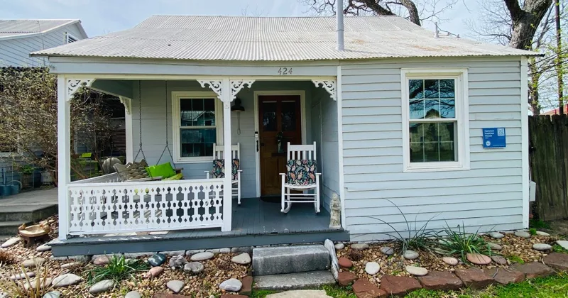
For a property, the best preview is usually a great photo, not your logo. Comal Inn uses the front porch of the cottage. This is the one place the photo should win, because the person getting the text hasn't seen your place yet. Your brand still shows in the page title under the photo.
Which file goes where
Here's where each part of a brand kit shows up for a small property, and the file that works best there.
- Website header
- Which version: Horizontal logo, color
- File: SVG
- Website footer or dark sections
- Which version: Horizontal logo, white
- File: SVG
- Browser tab
- Which version: Favicon
- File: ICO and SVG
- Google search results
- Which version: Favicon
- File: Square, larger than 48 px
- Phone home screen
- Which version: App icon
- File: PNG, 180 px for iPhone
- Google Business Profile logo
- Which version: Mark on a solid square
- File: PNG or JPG, 720 px
- Facebook and LinkedIn profile
- Which version: Mark on a solid square
- File: PNG
- Shared links (texts, Facebook, LinkedIn)
- Which version: Link preview image
- File: PNG or JPG, 1200 × 630
- Booking engine page
- Which version: Horizontal logo and brand colors
- File: PNG, or what it accepts
- Email signature
- Which version: Small logo or mark
- File: PNG
- Sign, welcome book, Wi-Fi card
- Which version: Any version, plus one-color
- File: SVG or PDF for the printer
- Stickers, hats, shirts
- Which version: Mark or stacked logo, one-color
- File: SVG for the print shop
Sizes on social sites change from time to time, so check each site's help page before you upload. For profile pictures, center the mark on a solid square with plenty of space around it. Google and Facebook show profile pictures in a circle, and a logo that fills the square gets its corners cut off.
Why it comes before the website
The order matters. First comes the brand, meaning the look, the colors, the logos and the voice. Then the website gets built from it. Then the content, your Google profile, your listings, your sign and your booking engine page all follow the same look.
Do it the other way around and you pay twice. A new logo after a website is built means new colors, new images and new favicons, and every profile and listing has to be updated by hand.
It also matters for direct bookings. When a guest taps Book on your website and the booking page has the same logo and colors, it feels like the same business, so booking direct feels safe. When the booking page looks like a different company, some guests stop and wonder if they're in the right place. Most booking engines let you add your logo, and many let you set your colors. With a brand kit, that's a quick job.
The look is half of it. The other half is how you sound, from room names to the way you describe your place. That's brand voice, and the two work best together.
Refresh or start over
If your logo is ten or more years old, you don't always need a new one. Past guests know it. It might be on your sign, your mugs and your keychains.
A refresh keeps what people recognize, like the shape, the colors or the feel, and redraws it clean. Sharper lines, a more modern font, colors that are easy to read on a phone, a simple mark for favicons, and every version and file type you were missing. Guests still know it's you. It just looks like you take care of the place, which you do.
Start over when the old logo doesn't fit the property anymore. Maybe you renovated, changed names or now attract a different guest. Or maybe the only copy of the logo is a blurry JPG nobody can find the original of.
What to ask for
Whoever makes your logo, whether that's a designer, an agency or a friend who's good at this, ask for these:
- Every version. Horizontal, stacked and mark only. Wide spaces, square spaces and tiny spaces all need a different shape.
- Every color. Full color, white for dark backgrounds, and one color for printing, embroidery or engraving.
- SVG and PNG. SVG for your website and your printer. PNG for everything that won’t take SVG.
- A favicon set. Browser tab, Google results and phone home screen, ready to drop into your site.
- Profile images. Your mark on a solid square, with room around it so a circle crop doesn’t cut it off.
- Your colors as codes. The exact hex codes, so your website, booking engine and Canva all match.
- A one-page guide. Which file to use where. It saves you from guessing, and it saves the next person you hire.
- A lookalike check. Run the mark through Google Lens before you commit to it, and look at the visual matches.
Keep it all in one folder you control, not in someone else's account. If you ever change designers, web builders or print shops, you hand them the folder and they have everything.
Quick answers
Does my Airbnb need a logo?
If you only ever book through Airbnb, you can get by without one. If you want repeat guests to find you and book direct, a logo helps. Your photos sell the stay, but a logo and a consistent name are what guests remember and search for later. They also go on your sign, your Google profile, your social media pages, your website and anything you sell.
Can I put my logo on my Airbnb or Vrbo photos?
Not as an overlay. Vrbo says photos with text overlays like URLs, or watermarks with logos, may be rejected. Airbnb doesn’t allow links in listings that take people off Airbnb. That’s why the property itself, and your own website, are where your brand does its work.
Should my logo be SVG or PNG?
Both. SVG stays sharp at any size and is tiny, so it’s the best choice for your website and for printing. PNG is a picture made of pixels, and it’s what Google Business Profile, most social sites and email signatures expect. A good kit gives you both.
What size should my Google Business Profile logo be?
Google recommends photos at 720 by 720 pixels, with a minimum of 250 by 250, as a JPG or PNG between 10 KB and 5 MB. Use a square image with your mark centered and some space around it.
Should I redo my logo before or after my website?
Before. Your website, booking engine, Google profile and listings all pull from your logo and colors. Doing the brand after the website usually means redoing parts of the website.
Want me to look at your site?
Send me your website. I'll tell you what I'd fix first, for free.